Open studio: have you ever wondered what rhythm looks like?
Could computers facilitate the construction of a new visual-musical language that enhances our understanding of music and art?
I have always been interested in the sketches and colour tests that surround the canvasses of paintings, as they provide insights into the artist’s process. So in the same spirit, here I wish to share experiments, ideas, and techniques that help inspire my work, and often take me in unexpected directions. I invite you to my studio in Valencia, Spain, to share sketches and studies that I hope may inspire you too. I call this Open Studio.
Have you ever wondered what rhythm looks like?
I wanted to gain a better insight into this question, and so ran some experiments. The results were not what I imagined. I was surprised by what appeared. I expected something dryly mathematical, but instead saw something curious and beautiful.
Before proceeding, let me define rhythm: it is how we divide time. We live within various rhythms, dividing days into 24 hours, weeks into 7 days, and years into 12 months. Musicians do the same though generally use smaller timescales such as seconds, though the principles are much the same.
To explore rhythm visually I built a simple program in P5JS (the code is at the bottom of this post) to divide a white space with thin vertical black lines. In addition to images I wanted to explore the process through sound, so built a simple program in Supercollider.
Beneath each image is a sound representation of the visual pattern. In contrast to traditional Western music notation, I have composed the sound such that the higher lines represent lower notes, and the lower lines represent higher notes, as I found this sounded better.
Getting started
We can begin the process with a simple rhythm. In the image below the vertical lines represent the rhythm, and the white space represents time.
The pattern shows two rhythms: the top half has two vertical lines, and the bottom half has three (there is a subtle line at the left of the image). A musician will recognise this as a 2:3 polyrhythm; the rhythmic backbone of traditional jazz.
To continue the process we can add additional rhythms to generate more complexity, for instance, by having eight rhythms simultaneously. By doing this we enter a more abstract territory because it is more than any musician can likely play.
In the image above the mirror symmetry of the pattern is obvious. This means the pattern will sound the same regardless of whether it is played forwards or backward.
If you listen carefully to the audio the line that runs down the centre of the image can be heard as a chord (the first time at 2 seconds). The overall pattern repeats four times, with the chord heard halfway through the pattern.
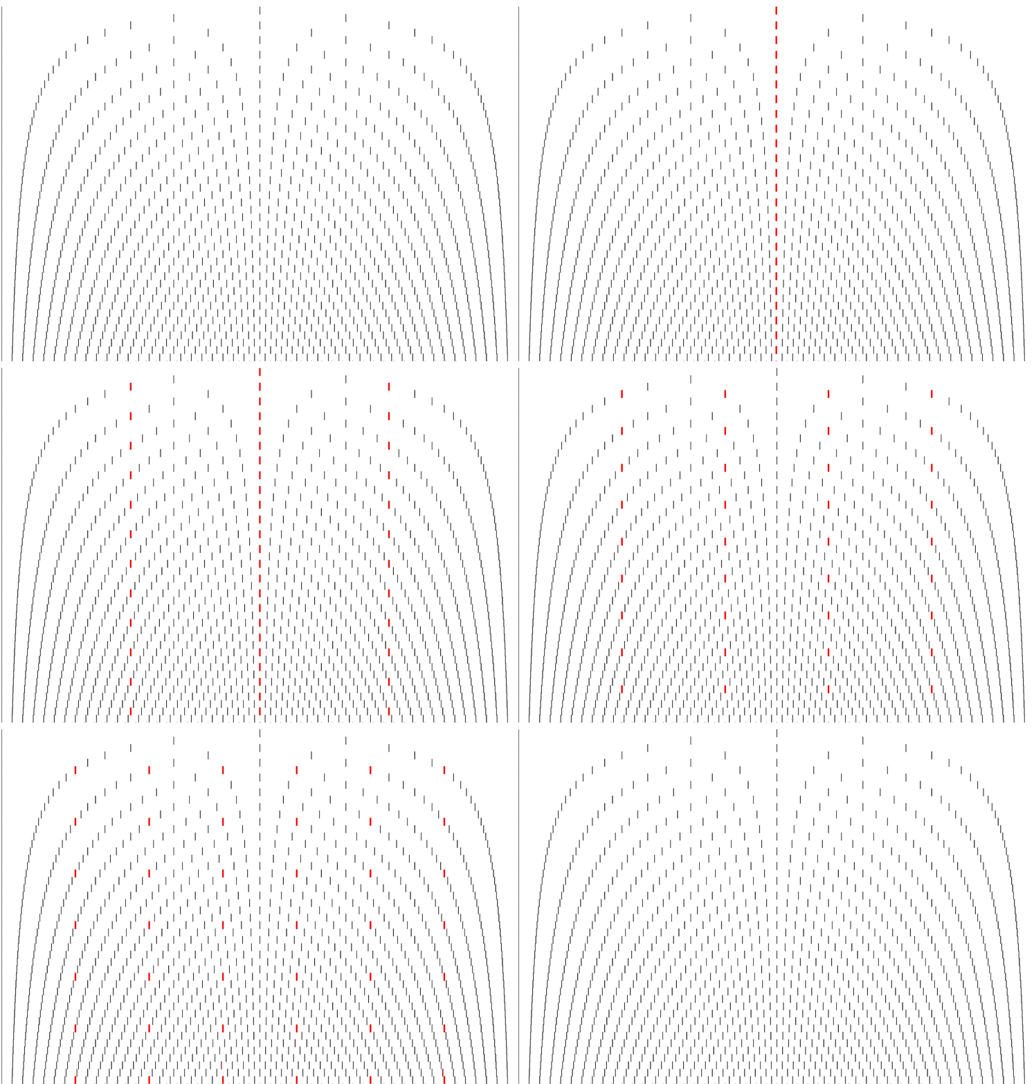
To add more complexity we can combine 50 rhythms, which creates an abstract image of greater beauty.
In the image above we can see two curves in mirror symmetry. Various chords can be heard throughout, not least of all at 16 seconds when the centre line is heard as a large chord.
By adding colour we can see a variety of straight lines dividing the image into two, three, four, five, six, and seven (one could keep going).
Now we can combine 150 rhythms.
The image above has even greater complexity, with the curves separating into smaller curves. Even though the image is composed of straight lines, they combine in such a way to create the illusion of lines bending in various directions.
The audio is full of chords as more lines coincide, with the bulky centre chord — which can be heard at 20 seconds — containing 75 notes.
Now we can continue to now combine 750 rhythms!
Depending on the size of the screen you are using you might see a whole series of star-like objects emerge amid the overlapping effect of moiré patterns.
There is a dark star at the bottom centre, with all other stars emanating outwards and upwards from this point, gradually becoming smaller and lighter with distance. Additionally, on both sides of the lower half of the image can be seen patterns bending against the edges, which create interesting ripple-like effects.
The sound is just as complex as the image. It takes longer for the entire pattern to unfold than in the previous examples, allowing for all the subtle details to be heard. Fascinating patterns and chords can be heard throughout that burst, swoosh, and sweep through the frequency spectrum
For another interpretation, at the top of the article I have created a second audio version that unfolds more slowly, with the notes being held for longer.
So, what does this all mean and why does it matter?
I created these images a year ago motivated by the spirit of experimentation, rather than with any fixed goal in mind, and had no intention or idea of ever publishing them. In general, I find good ideas often develop from exploring intuition and curiosity in a playful, somewhat childlike manner, without the need to rationalise or justify what I am doing (or at least not until later).
With that said, the connection between visual images and sound is a powerful one that has the ability to strongly influence music, and for that reason I consider it a fruitful terrain to explore. The connection between visual language and music was excellently described by the late music writer Richard Taruskin in his fascinating book Music from the Earliest Notation to the Sixteenth Century.
The development of musical literacy also made possible all kinds of new ideas about music. Music became visual as well as aural. It could occupy space as well as time. All of this had a decisive impact on the styles and forms music would later assume. It would be hard for us to imagine a greater watershed in musical development.
What is interesting about Taruskin’s book is that he points out that notation was not seen as a remarkable development at the time.
Nobody thought of it then as an event worth recording, and that is because this innovation — momentous though it may appear in retrospect — was the entirely fortuitous by-product of political and military circumstances.
I wonder if something similar might be true now. Perhaps computers are facilitating the construction of an additional visual language for music that could help provide imaginative leaps and provoke new musical ideas.
To create such images by hand would take many hours of painstaking work, and likely result in inaccurately spaced lines. Using code it takes less than a second to generate them. There is no doubt in my mind that in the absence of a machine I would not have created them, and for this reason they strike me as a good example of how machines have the potential to enhance our understanding of art.
By looking at the image that contains 750 polyrhythms I felt inspired to explore new ideas in sound. Likewise, another person may look at the same image and see something entirely different, which leads to another creative process. It is often stated that an image can say a thousand words, but can they also imply new sound worlds?
I learned a lot about music by exploring these images and the sounds they inspired. They gave me a better sense of the mirror symmetry of polyrhythms than years of studying, playing, and composing music. What astonished me more than anything, however, was seeing star patterns emerge from polyrhythms. It is something I would have never imagined. The musical significance of it? I am not sure. Maybe I will discover some musical importance for them one day, but even if not, they represent an idea and image that is beautiful, which in itself means something.


The 750 poly-rhythms one is basically an entry-level Electric Waves of Resistance track: https://www.youtube.com/watch?v=Z-zxGYaAp0o
Mind blowing!